Showing posts with label planning. Show all posts

Friday, 19 April 2013

Digipak: Creating Inside Front Cover

So on my design, this is where the drawing of the house would've been but instead I decided I wanted to add some lyrics.
So while I was filming my teenagers in the park I took a few pictures to put onto my digipak.
I wanted these pictures to feature as a piece of each age is involved in the digipak, obviously this represents the teenage years.
Here are some of the photos I took:


The photo I chose in the end was: 

I chose this because I thought it was quite artistic (keeping with the genre) and a nicely framed shot. 
I then chose the font for the lyrics, I wanted it to be quite simple, so I went for Ariel rounded. 
The only thing about this cover is that because the picture is so colourful it was hard to pick a font colour that would stand out. In the end I decided to go for black because it was easier to read most of the text. 


Friday, 12 April 2013

Digipak: Creating Front Cover

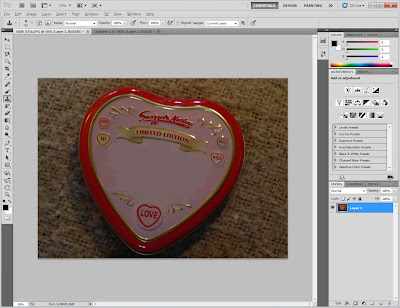
When filiming my children I took a picture of the tin I used in the whole of my music video. This is when an idea cropped up, as the tin is so significant, maybe I could use this image but change the text of Love Hearts to "The Rumble Strips".

I then turned to photoshop...

To start with I cloned away the original text: 

I then looked for a similar text that was for the "LOVE HEARTS". I decided to use STENCIL. 
After I added the text, I edited the layer so it looked more realistic and like it was actually embossed into the tin. Changing the depth of the style and softening it, and also changing the opacity: 

To incorporate the stars from the font I cut out the stars using the quick selection tool and dragged it across to my edited tin and added them on: 


This is my finished project, which I am pretty impressed with! 


Friday, 15 March 2013

Digipak: Creating the Back Cover

So after my first attempt of filming yesterday and my discovery of Kirty's black board drawing I thought it would look good as either my poster or on my digipak.
In result I decided to experiment of putting it on my digipak.

At first I did consider using it for the front cover however, I thought the amount of black wouldn't really catch a consumers eye. It also isnt a very exciting colour, so instead I thought about using for my back cover, rather than the scribbles I originally had.

I opened my image onto photo shop and tidied up the bits of white chalk which had been rubbed off by using the cloning tool:

I then realised that I needed to pick a font that would match the picture to put in the song lists. I tried a few however, I felt none of them looked very good, so in the end I decided to try and draw the text on. 

I did this by using the paint brush and picking a brush that give it a chalk effect: 

I manage to find a realistic effect, using the drawn on text matches the indie genre as it is something different. And really matches my intentions of childhood. 

I also added, two bar codes, including a Blackberry one. As consumers now use modern technology to find out more about the band, this barcode takes Blackberry users to their 'website'. 
I got the pictures from google and then dragged them onto my back cover:
Originally I did a single album cover, but after speaking to my teacher I decided to add on more songs to make it into an album, here's the finished picture: 


Tuesday, 12 March 2013

The Perfect Tin!

Today I went on a sweet tin search! After trekking it all over my town in my free, going into various shops I had no luck! Losing faith, I got a message from my mum saying she had found a 'Love Hearts' tin in the shop near her work. She picked me up, and there, to my amazement was the PERFECT love heart tin!!!

Rather than the Haribo love hearts, this tin had the sherbet love heart sweets in, which also has a vintage and more sentimental appeal to it. So I decided that changing to the sherbet love hearts was a good idea as it was much cuter and suited the tone of my music video!  Its going to be heartbreaking when I have to slightly abuse my tin in order to make it look older!

Monday, 11 March 2013

Equiptment

I'm finally filming on Thursday which is incredibly exciting!
The camera I will be using is the Cannon 1100D. I chose this one because the resolution is good, and I used it last year so I am already familiar on how to use it.

I will also be using a tri pod, and the sound will come from the camera it self, as this camera does not have a microphone input.

Costumes

I want my actors to wear modern costumes, because I want it to seem quite timeless. I dont want anything too mainstream. I also dont want them to be glamorous as this isnt what you'd expect for an 'Indie' genre. I want my audience to feel like they can relate to my couples, so I want the outfits to be quite simple and something you may expect to find in a high street store.  I want Kirst and Effie to wear something either pink or red to relate to the sweet tin. This could also link to some idea's I have had for my digipak. I also definitely dont want any aspect of the Male Gaze theory so Effie will be in a shirt and trousers.

Children


Teens


Locations

Old Couple
In their lounge. Sat on their sofa, as it will be their own place already gives me the homely Mise- En- Scene that I want to represent the 'togetherness'.

Children Couple
In a modern house. Having them in a house when we see them when their younger and also when they are an old couple gives the feeling that their lives have gone round in a circle. Making the equilibrium the same.
It also allows me to have access to the fridge meaning I can get the young boy to spell out "best friends forever" which is a main point of the story. It also links to my digi pak.

Teen Couple
Carvers park on the park roundabout. This is the last day the spend together before the boy has to leave. Like they are reliving their childhood.

Props


  • sweets (love hearts)
  • sweet tin (one new and one slightly battered)
  • football
  • cup cakes
  • play park

Tuesday, 5 March 2013

SCRIPT 1


This is my first draft of the script the old couple will use at the beginning of my video. There is a chance it may change, by either making it longer or changing the setting for when the teenagers meet.

Initial Idea

The initial idea to my music video is a narrattive which follows the story of an older couple that met when they were just children. My main idea came from the film 'When Harry Met Sally", in the film there are mini-scenes thhat have an old couple telling a short story about how they met each other.


I've decided that I am going to adapt from this idea by having a 30 second clip at the beginning of my video of an old couple describing how they met, then the rest of the video will be seeing them through the different stages of their lives.
During the 'teenage' years I dont want them to officially be together as it will give my story more shape, also allowing me to follow the narration conventions of Torodov.

Monday, 4 March 2013

Narrative in Music Videos

For my music video I have decided I would like it to have a narrative. The main feel of the song is very major and jolly, with a 'feel good' vibe. It also makes me think of Summer so I want my narrative to be happy.

I googled 'Music videos with love narrative' and found a youtube playlist called "20 Best Music Videos that Story Tell" to look for elements that narrative music videos involve. I've written notes on the things I like:


The narrative is clear and obvious. The love story is effective with interesting and original camera shots. The acting here is exaggerated, especially with the expressions, as no speech is used.

Gwen Stefani - Cool
Includes flash backs of when they were together, showing there love with warm lighting.
Dress codes - with red dress, however some of the costumes are a bit too 'glam' for an Indie genre.
A lot of slow motion and focus on the eyes, however this is more of a sad love song.

Watching the rest of the videos in this playlist, it became apparent to me that each video either was a 'love tradegy' or had a 'struggle' in their relationship.
 For example Bruno Mars' Grenade is totally depressing, and definitely isn't what I'd like my music video to be like!
 However, as most music videos do feature a problem with in the story line, I have decided that my teenage couple are going to experience a 'problem' with in their relationship.

Friday, 15 February 2013

Digi Pak Behind CD Creating

I've started creating my digi pak for my music video.
For behind the CD case I wanted to use sweets as these are childish, and Haribo are often related to children.
In my orginal plan I was going to use liquorice strips to make birds, like on the front picture, however I could not find any of these at the time so decided to put some teddy bears in there instead. This was better as it included more colour and thats definitely what I wanted.

SNAP SNAP
Instead of creating the sweets on the computer I took pictures on plain white background.
This is how I orginally led them out, in the shape of a CD and the egg in the middle.
However the shading on the background made it look quite dirty, so I decided to cut each sweet out and apply it onto a plain white background. This also meant I could move the sweets around.


After doing this my result was.. .

Draft 1  
Heres my first draft of under the CD case, I added the drop shadow to give it more depth, but I think that it looks a bit plain. I might experiment with different backgrounds which may give it more character.

Sunday, 10 February 2013

Digipak Research

Kate Nash

This digipak has hugely influenced mine. It has a wide shot of a house, which is similiar to the house I want drawn on my digipak.
The image looks surreal as it has been created on the computer. The colours are bright, and you can see Kate Nash, the artist, in red so shestands out.
The font is simple and immitates hand written text. Following the conventions of childhood. Just like mine!!
Vincent Vincent and The Villains
Here, they have gone for the scruffy text, and a feel of hand drawn stripes.
They have also combined computer text, on top of a picture, just like my design (without the computer text!)

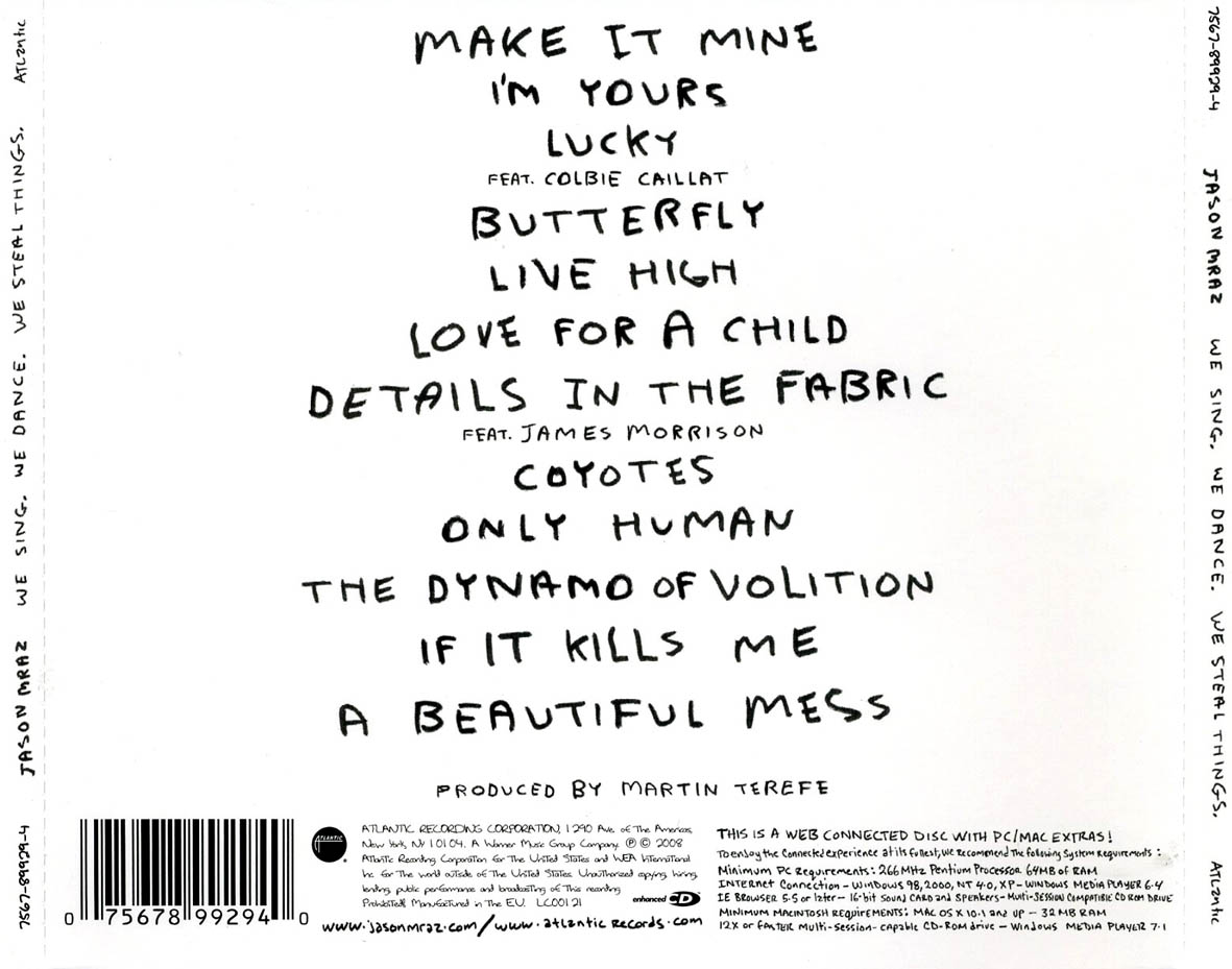
Jason Mraz
Larger Front
This is similar to the Kate Nash digipak. The font is simple and looks handwritten. The picture is drawn, again something I'd like to feature in mine. It isn't anything jazzy and could show he thinks music is more important than the glossy outfits and fame!