Kate Nash

This digipak has hugely influenced mine. It has a wide shot of a house, which is similiar to the house I want drawn on my digipak.
The image looks surreal as it has been created on the computer. The colours are bright, and you can see Kate Nash, the artist, in red so shestands out.
The font is simple and immitates hand written text. Following the conventions of childhood. Just like mine!!
Vincent Vincent and The Villains
Here, they have gone for the scruffy text, and a feel of hand drawn stripes.
GdUBPnUfn8BWw~~60_35.JPG)
They have also combined computer text, on top of a picture, just like my design (without the computer text!)
Jason Mraz

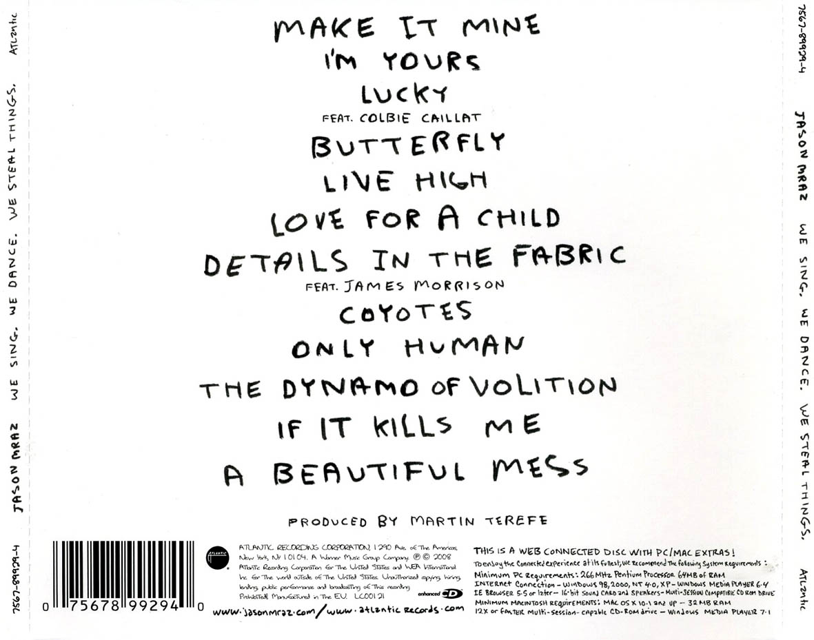 This is similar to the Kate Nash digipak. The font is simple and looks handwritten. The picture is drawn, again something I'd like to feature in mine. It isn't anything jazzy and could show he thinks music is more important than the glossy outfits and fame!
No comments:
Post a Comment